Here are the designs for all the lavender fundoshi.
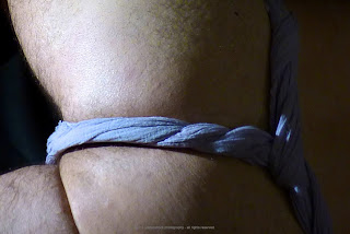
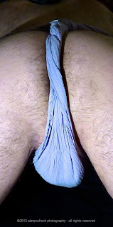
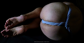
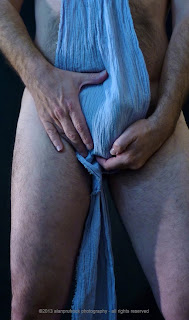
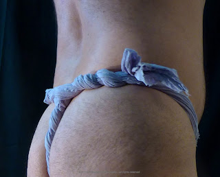
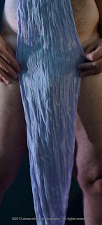
Here are some of the pictures that didn’t get into the original posts. You can tell by the lighting this was done in two different shoots. One was in low light and quite moody, while the other had a more natural look.
Perhaps this is an appropriate time to talk about the approach I take when editing the photos. I generally use a program called Aperture to make adjustments, but I have been known to use Photoshop as well. Many people don’t realize that digital photos can be a bit ‘fuzzy’ out of the camera. There are simple tools most photo editing programs have to ‘enhance’ or ‘sharpen’ a picture. I use a sharpening process for all my photography. I am thankful to friends that do photography for a living for teaching me this.
As far as touching up a photograph is concerned, I generally try to keep everything looking as it did during the shoot. This means that my skin tone sometimes will be darker or lighter, depending on the lighting conditions. Since the white backdrop is so unforgiving from a tone and wrinkle perspective, I have been experimenting with blurring techniques to make it softer. You will see some of that in future blogs.
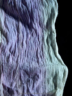
For the shots that show off the fabric and design, I tend to be a little looser with the manipulation. I will pump up the saturation if that gives the photo a better look. As I’ve said before, I’m not a photo-journalist, so a little artistic fun is a happy thing!
There is one thing I will manipulate from a ‘touch-up’ perspective. If there is a blemish...okay, I’ll say it out loud....pimple on my posterior, I will remove it. Face it, you don’t really want to see it and I don’t want to show it. It doesn’t happen often, but when it does, I end up doing a lot of work as it will infect the entire shoot!
Fundoshi....very soft after a couple of washings. For the ‘fundoshi as art’ shots, I like the glow that comes through on the fundoshi that had large amounts of white from the discharge technique.
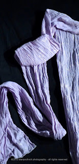
Fabric....crinkle gauze. This is quite a good material for photographs. The texture adds some nice pattern and depth.
Photography....A bit more close-ups in this group with a concentration on lighting.
And now...the rest of the photos....
Next time on fundoshi fabric and photos, a final look at the hunter green cheesecloth fundoshi. Once again, throwing caution to the wind with this rather see-through fabric!








No comments:
Post a Comment