Sunday, May 29, 2016

Fundoshi Rehash 31 - White Gauze Part 2

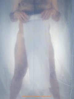
Todayʻs fundoshi rehash is the last group of extra photos from a rather complicated (from a setup standpoint) shoot. You can see the explanations of what I did and the original posts herehere and here. The first set of rehash photos I changed to black and white. While the setup for the original photos washed out color, I decided to try to take a more overblown approach with these. 
fundoshi rokushaku
fundoshi rokushaku 

You can probably tell the first thing I did was an increase in the exposure, pretty much blowing out the white back-light as well as the fundoshi.
fundoshi rokushaku
fundoshi rokushaku 
I then changed the white balance to be a little more neutral and increased the saturation and vibrancy to give a more colorized look. 
fundoshi rokushaku
fundoshi rokushaku 
 For the final changes, the edges were sharpened a bit for a crisper effect and I applied a light vignette to darken the edges of the photos. 
fundoshi rokushaku
fundoshi rokushaku
fundoshi rokushaku


...more...
Sunday, May 22, 2016

Fundoshi Rehash 41 - Inked White Gauze

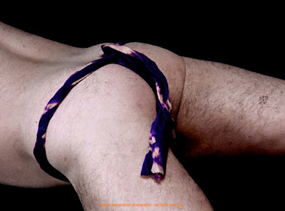
If you have been following, you know my normal design mode is to remove the color from the fabric I work with when creating fundoshi. Todayʻs rehash uses extra photos from a shoot I did where I tried using inks to color a white gauze fundoshi. You can see the original shoot here and here. My goal in these manipulations was to add a bit of a dark, moody tone. Since the color faded so much after the wash, I also wanted to try to enhance the colors a bit. 

fundoshi rokushaku
fundoshi rokushaku


The first set of adjustments were in the exposure arena. I turned it down a bit and increased the black point. 
fundoshi rokushaku
fundoshi rokushaku

 Next up was to increase the contrast and the saturation. For the final look, I added a dark vignette for the stormy edge look. 
fundoshi rokushaku
fundoshi rokushaku
fundoshi rokushaku


...more...

Sunday, May 15, 2016

Fundoshi Rehash 35 - Deep Burgundy Gauze Part 1

I know, more burgundy gauze....this time with a dark background. Shots from the original shoot can be found here and here. As with other extra photos where the original shoot was done with minimal lighting, for this set, I wanted to get a more focussed and detailed look from the rather soft originals.

fundoshi rokushaku
fundoshi rokushaku

To start with, I increased the black point a bit...mostly in preparation for the next steps.
fundoshi rokushaku
fundoshi rokushaku

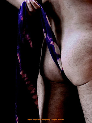
The overall contrast was then increased, then I concentrated on increasing the contrast in the mid-tone areas. The final look below comes from playing with an edge sharpen filter. The combination of the edge sharpen with the increased black point is what gives the detail on the body hair, which I personally like!
fundoshi rokushaku
fundoshi rokushaku
fundoshi rokushaku
fundoshi rokushaku


...more...

Sunday, May 8, 2016

Fundoshi Rehash 26 - Blue Circle Design Part 2

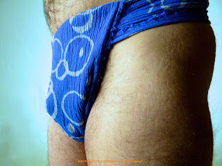
Originally seen in this post, I’m so Blue.....and so is my Fundoshi....., this rehash part 2 set takes some of the less than optimal blue fundoshi close up shots and tries to salvage them. One thing about the original shoot I didnʻt like was the fact the lighting made the fundoshi appear blue and light blue. The fact (seen in some of the ʻartʻ shots of the fundoshi) is that the light blue areas are actually white. 


Taking a queue from that, I decided to do a ʻblack and whiteʻ take on this set.

fundoshi rokushaku
Above is the original shot. I started by simply applying a black and white filter. 
fundoshi rokushaku
fundoshi rokushaku 

From there, I increased the contrast a bunch, then the saturation and vibrancy a little. The final look below has some exposure settings played with. 
fundoshi rokushaku
fundoshi rokushaku
fundoshi rokushaku
fundoshi rokushaku


...more...
Sunday, May 1, 2016

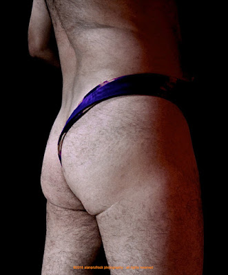
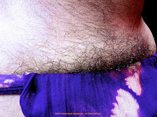
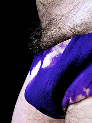
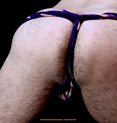
Fundoshi Rehash 40 - Purple Gauze Look 3, Part 1

Yes...more purple fundoshi! You can see some of the original photos herehere and here


fundoshi rokushaku
fundoshi rokushaku 

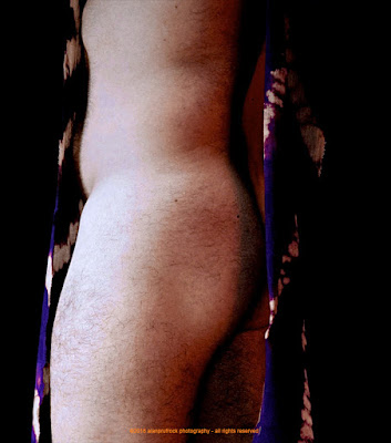
The changes are a bit subtle for this rehash. My main goal was to remove some of the pink tones from the original shoot. Unfortunately, they were there based on some purple gels in the lighting. I first played with the white balance a bit.
fundoshi rokushaku
fundoshi rokushaku 

I then increased the exposure and black point and turned up the contrast. For the final look below, I went into the individual color settings and played with the red, yellow and magenta channels. 
fundoshi rokushaku
fundoshi rokushaku
fundoshi rokushaku
fundoshi rokushaku
fundoshi rokushaku
fundoshi rokushaku
fundoshi rokushaku
fundoshi rokushaku
fundoshi rokushaku
fundoshi rokushaku
fundoshi rokushaku
fundoshi rokushaku
fundoshi rokushakufundoshi rokushaku
fundoshi rokushaku
fundoshi rokushaku
fundoshi rokushaku
fundoshi rokushaku
fundoshi rokushaku
fundoshi rokushaku
fundoshi rokushaku
fundoshi rokushaku
fundoshi rokushaku