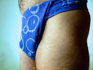
Originally seen in this post, I’m so Blue.....and so is my Fundoshi....., this rehash part 2 set takes some of the less than optimal blue fundoshi close up shots and tries to salvage them. One thing about the original shoot I didnʻt like was the fact the lighting made the fundoshi appear blue and light blue. The fact (seen in some of the ʻartʻ shots of the fundoshi) is that the light blue areas are actually white.
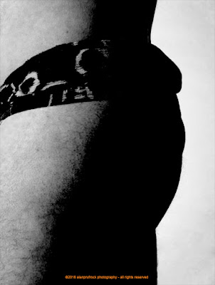
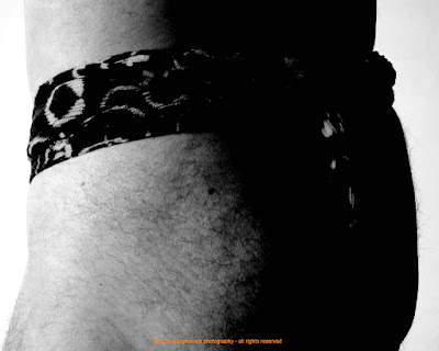
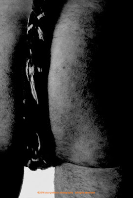
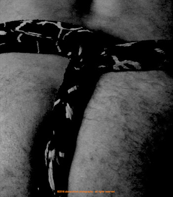
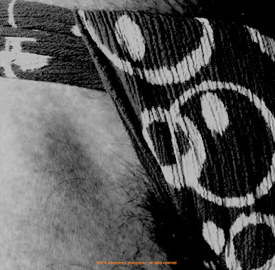
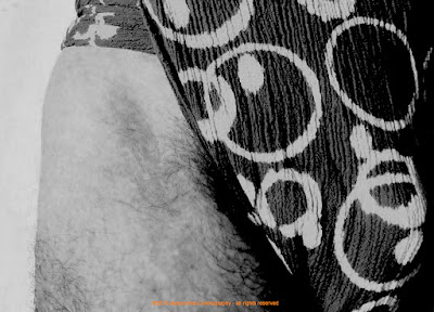
Taking a queue from that, I decided to do a ʻblack and whiteʻ take on this set.
Above is the original shot. I started by simply applying a black and white filter.
From there, I increased the contrast a bunch, then the saturation and vibrancy a little. The final look below has some exposure settings played with.
...more...








No comments:
Post a Comment