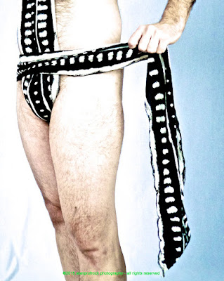
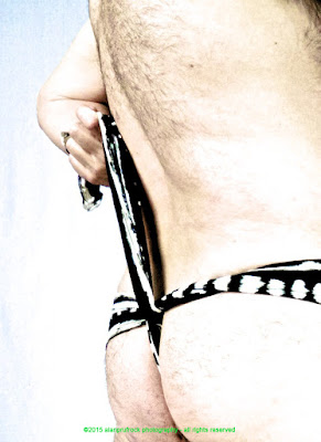
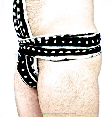
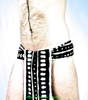
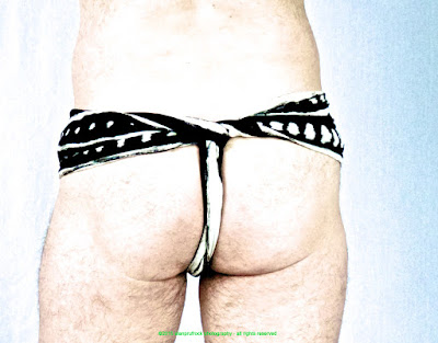
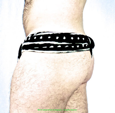
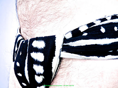
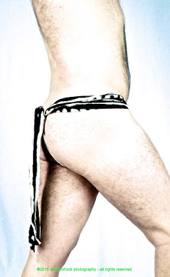
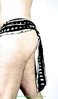
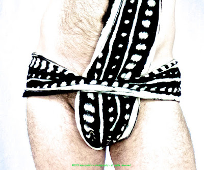
Since I like this black and white pattern so much, I wanted to see how much of a blow-out I could get to minimize the background and the body, while still being interesting to look at. I must be getting a bit better at the post-production stuff as the desired look took a quick adjustment to only 2 different settings.
Here is the original.
I then increased the exposure and the black point. This was close, but I wasn't pleased with the skin tones.
The saturation was decreased and the definition was increased, and I was pleased!
...more...








No comments:
Post a Comment