Sunday, October 25, 2015

Fundoshi Rehash 18 - Black Voile Squared Part 1

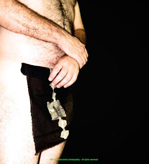
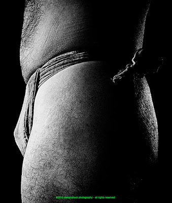
A dark fundoshi made of voile is a pleasure to wear. The darker colored voiles seem to be thinner and lighter, making them a cool choice to put against the body. You can see the original photos today's rehash is based on here and here
fundoshi rokushaku
fundoshi rokushaku


After the first 'update', I know these transitions seem quite subtle, but I like the final results. For the first update, I simply bumped up the exposure. This gave me the blow-out of light feel I wanted.  

fundoshi rokushaku
fundoshi rokushaku


I then applied a 'toy camera' filter that adjusted and added all sorts of things like saturation, vibrancy, a vignette. Once that was done, I tweaked the contrast and definition a bit.  

fundoshi rokushaku
fundoshi rokushaku
fundoshi rokushaku
fundoshi rokushaku

...more...

Sunday, October 18, 2015

Fundoshi Rehash 17 - Burgundy Gauze - The Close Up Shoot

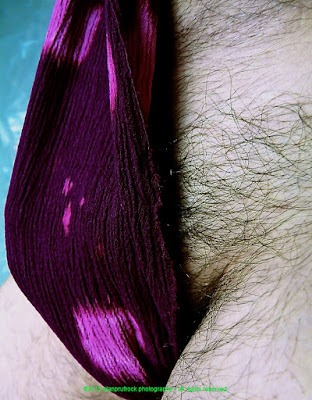
Originally seen here and here, there were over 200 'extra' shots that didn't make it into the original blogs. I think I took so many pictures because I was using a very different backdrop, and didn't know exactly how the photos would turn out. With so many fundoshi shots from this session just sitting on my hard drive, it was time to get them out again and start manipulating!

For today, I chose to work on the extra 'close-up' shots from the session. While the changes are quite radical, they were easy to accomplish. 


I simply used a filter in Aperture called 'Color Process 1', and viola - instant change. 

fundoshi rokushaku
fundoshi rokushaku
fundoshi rokushaku

...more...

Sunday, October 11, 2015

Fundoshi Rehash 15 - Teal Voile Part 2

The original photos for this lovely teal fundoshi made of voile can be seen here and here. In the last post-production blitz on the never-before seen extra photos, I tried to make the lighting and color look a bit more natural than the original. 

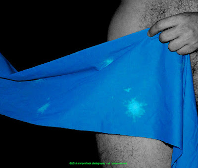
Today, I do some laborious, but satisfying post-production to highlight the color in the fundoshi. This meant using some filters to heighten the color a bit. The four shots below show the progression from the original to getting the fundoshi's color ultra saturated. I played with saturation, black point, highlights and shadows as well as bumping up the blues a bit. 
fundoshi rokushaku
fundoshi rokushaku 

fundoshi rokushaku
fundoshi rokushaku 


This photo shoes the result of the filters. I was satisfied with the fundoshi, but it did leave the skin tones a bit unsightly. Since my intent is always to show off the fundoshi, I applied a black and white filter, then erased the black and white from the areas of the fundoshi.
fundoshi rokushaku
I've done this before, and it takes time, patience and a steady hand. I like the results so much, there are a lot of photos for you to go through!
fundoshi rokushaku
fundoshi rokushaku
fundoshi rokushaku
fundoshi rokushaku


...more...

Sunday, October 4, 2015

Fundoshi Rehash 14 - Khaki Cheesecloth Part 2

Back to the extra photos from a shoot using one of my favorite cheesecloth fundoshi. The original photos were seen here and here. This was one of the quickest rehash post-production sessions I've had. I guess it offsets that amount of time it takes to do the spot coloring on some of the rehashes. 

Most of the changes were done in one step.  Below is the original I worked from and the single-click filtered version.  In Aperture, I chose to use the 'color process 1' filter. With one quick press of a button, the filter played with saturation and vibrancy, adjusted the curves and levels, highlights and shadows, sharpened the edges and added a bit of polarization until it came up with the photo on the right.
fundoshi rokushaku
fundoshi rokushaku


When I was doing this, I was in a bit of a black and white mood, so I then changed the photo to black and white, increased the black point a bit and added a vignette filter to darken the edges. You may wonder why putting the 'color process filter' on mattered if I was going to put it into black and white anyway. Below is a comparison of the photo from the original in black and white, and the filtered version. I like the strength in the filtered version better.
fundoshi rokushaku
fundoshi rokushaku

 fundoshi rokushaku
fundoshi rokushaku
fundoshi rokushaku

...more...