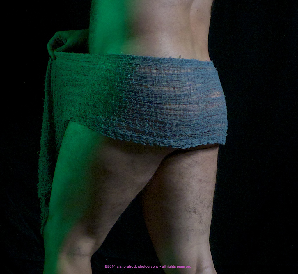
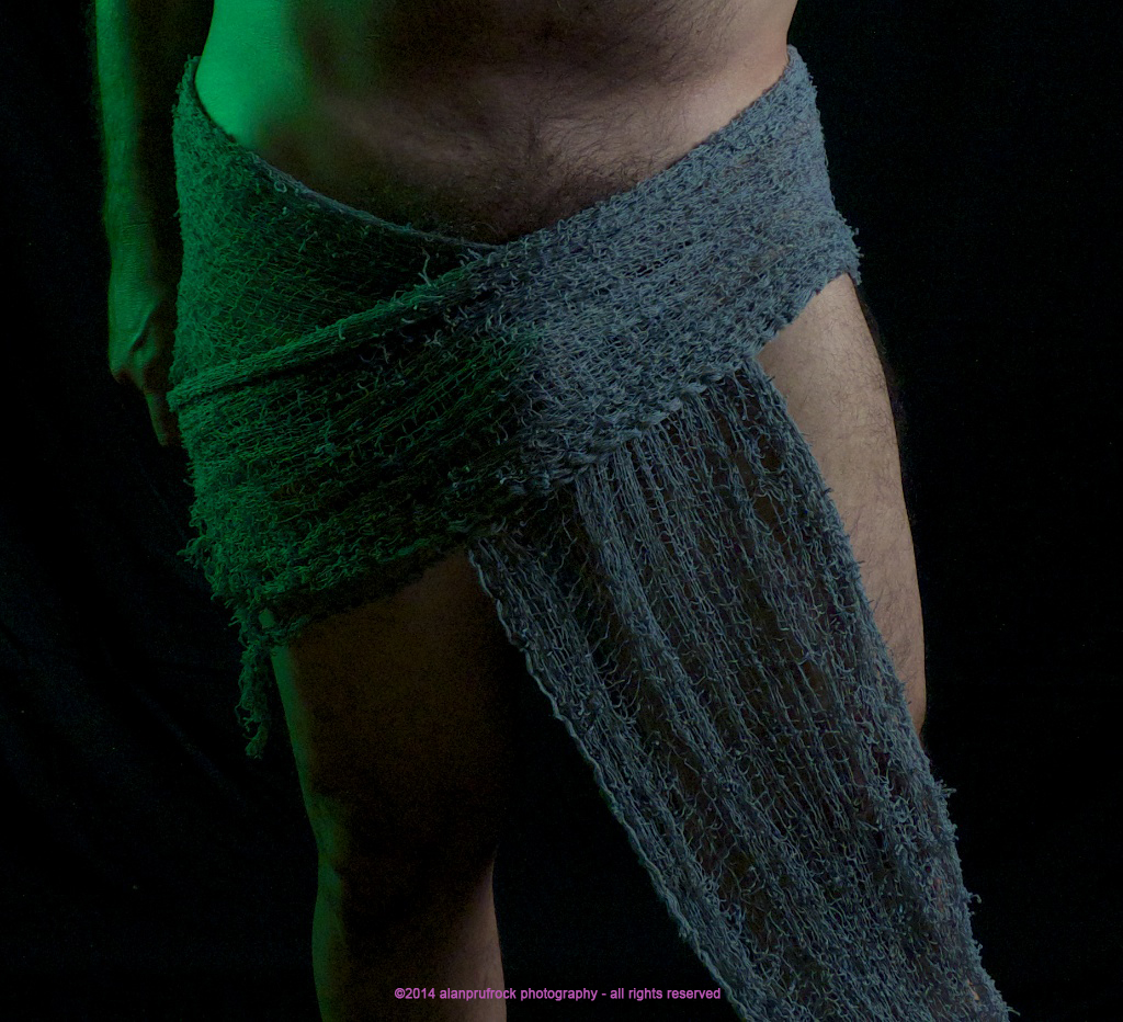
For this particular set of photos, I was playing with the grey spooky fabric to see how it flowed, how it lay across my body, etc. Some of the shots came out nicely, so I put them together in a blog of their own.
As you can see, I have swapped out the deep red gel for a deep green one. I think it worked well with the grey fundoshi.
I thought the black ʻspooky fabricʻ would be a bit more revealing as the contrast between my pale skin and the dark black is rather large. For the photos, the grey presented more ʻrevealʻ issues than the black. I will use this as a teaser....stay tuned for the rest of the shoot in the coming months for the proof of the previous statement.
I am still using a 2 light approach here, as I did in the last blog. For this, I moved the colored light a bit more forward so it would be more obvious. Again, not much done during post-production to influence the look of the photos.
fundoshi… grey....
...more...
Next time on fundoshi, fabric and photos: White ʻspooky fabricʻ fundoshi in a similar shoot - testing the fabric. Trust me, even though the shoot theories are the same, the photos are very different.....


No comments:
Post a Comment