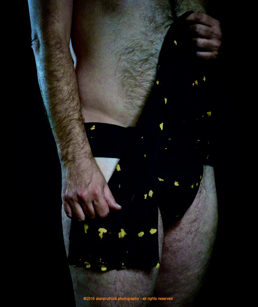
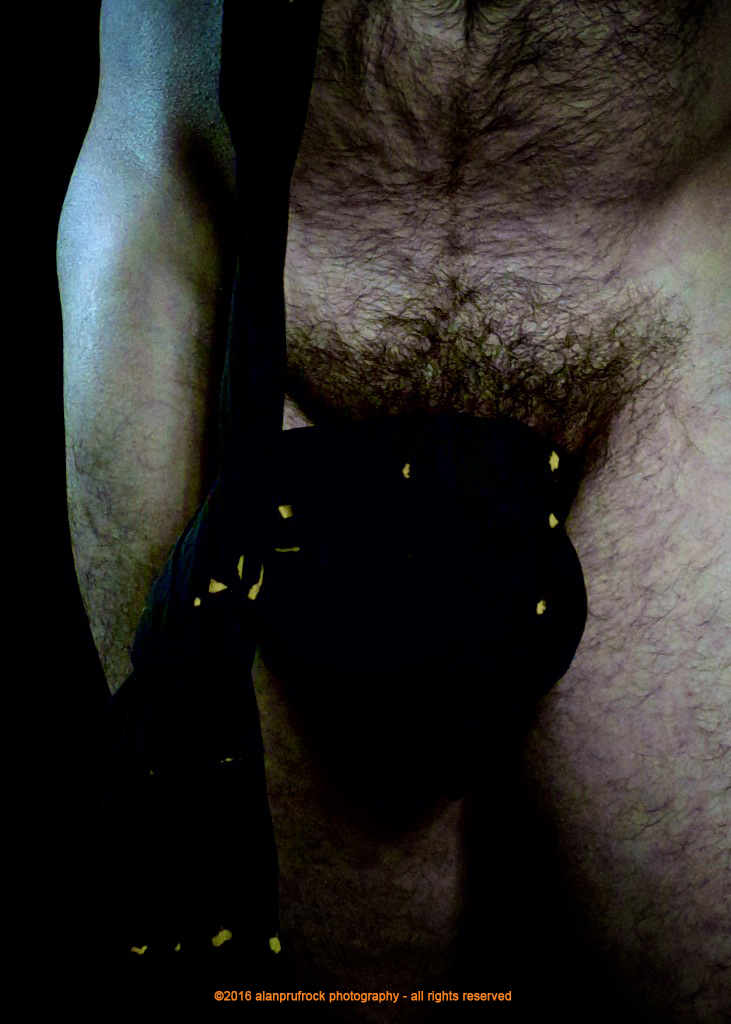
In dealing with the extra photos from the shoot, I wanted to see if I could get a different tonal quality out of the pictures.


The original has a nice, even tone and the dark brown fabric lent itself to keeping the pictures in a tan/beige look. To start with, I added a vignette to darken the edges.
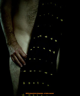

I then played a bit with the contrast of the mid tones. I then made some adjustments to the exposure, saturation and vibrancy which resulted in the yellow tones.

Finally, I adjusted the white balance to give them a cooler look. As you will see through the shoot, this resulted in some photos having more blue tones than others. I think this was due to how close I was to the camera, which would have a bearing on how much information was captured.


...more...


No comments:
Post a Comment