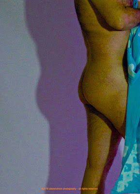
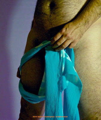
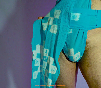
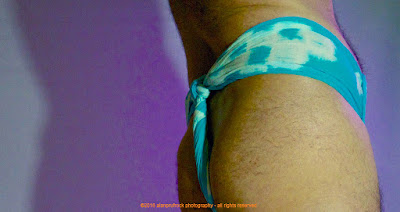
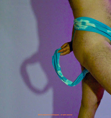
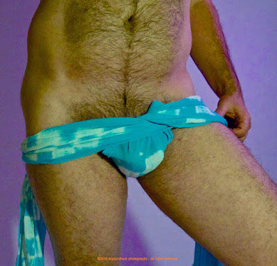
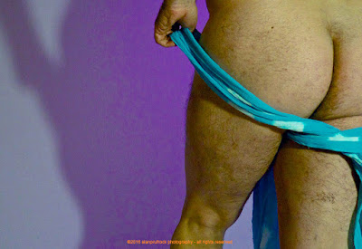
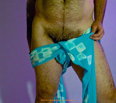
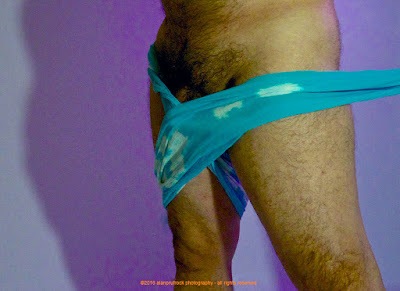
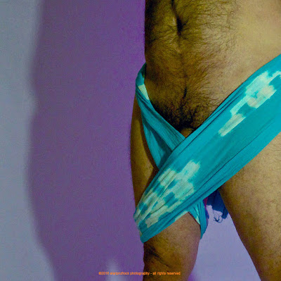
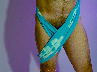
For this rehash, I chose some extra photos of one of the most recently designed fundoshi, the light blue gauze found here and here. I kept the originals a bit on the dark side for mood, so for this rehash, I thought I would just try to lighten them up a bit.
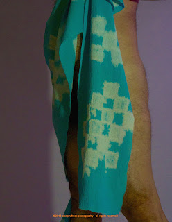
I first adjusted the curves to bring out of of the hidden highlight areas.
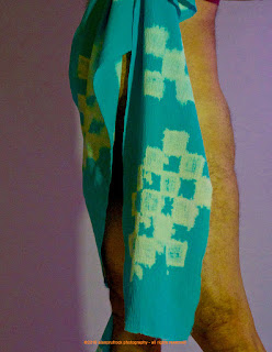
I then increased the overall contrast and saturation a bit to bring more variety to the color palette. Then I increased the exposure.
For the final look above, I then changed the temperature of the white balance to a more bluish tone. This got the colors a little more natural looking.










No comments:
Post a Comment