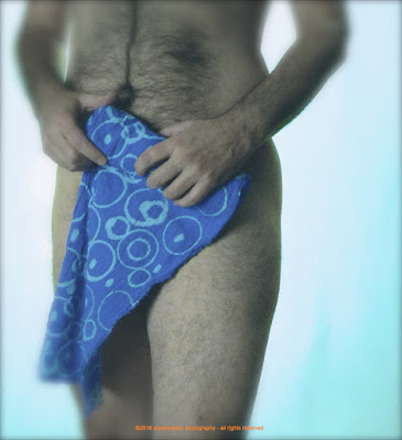
Originally seen in this post, I’m so Blue.....and so is my Fundoshi....., there were many surplus photos from this shoot since the lighting and camera settings werenʻt what they should have been. As I stated then, I try to learn from my mistakes.
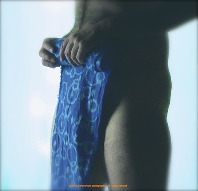
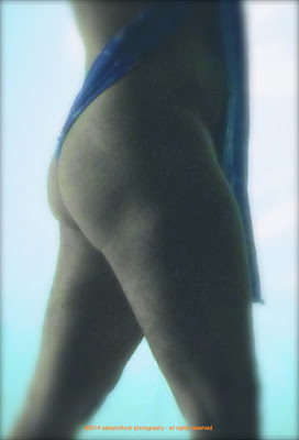
Having learned many tricks in this past year doing these rehash blogs, I thought I would take some less than optimum photos and see what I could do.

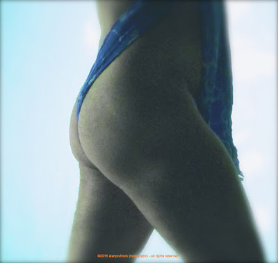
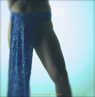
While the original on the left looks okay, this was one of the better shots from the session. Of the 50 or so surplus photos I chose for this rehash, only about 25 were worth working on. I started by blurring the edges and fading the entire photo to give it a slightly more romantic feel. To achieve the final look below, I desaturated the photo a bit more, but turned up the vibrancy a little to retain some of the light.
...more...









No comments:
Post a Comment