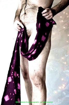
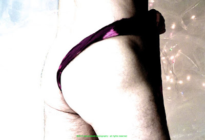
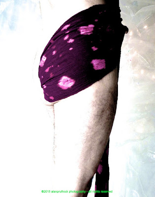
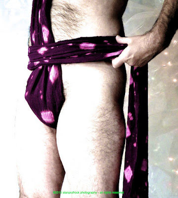
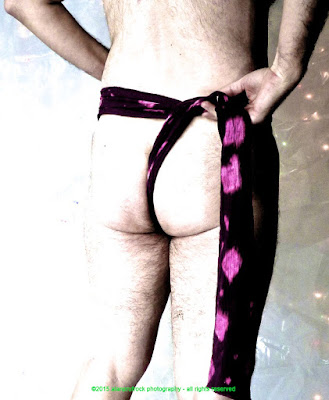
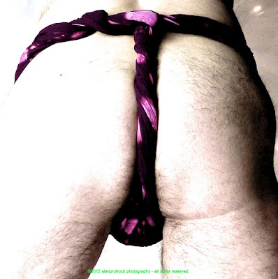
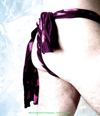
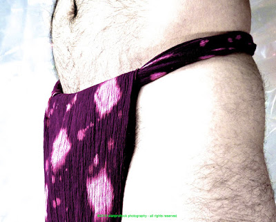
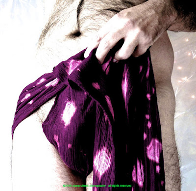
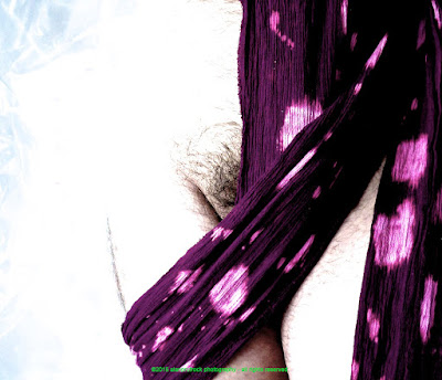
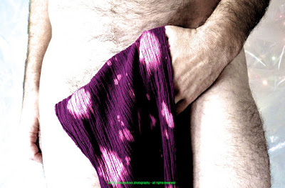
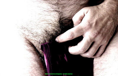
And now, the end of the burgundy fundoshi originally seen here and here, and in many other ʻrehashʻ posts. I wanted to try a flatter approach to the photos, and it only took a couple of adjustments.
Here is the original. I first started out by playing with the exposure. I turned it up quite a bit and increased the black point and the brightness. This left it quite ʻloudʻ and wasnʻt quite what I was looking for. It did serve a purpose for the next step.
I decreased the saturation, but increased the vibrancy.
This left the skin tone and background a bit flat as I wanted, but kept the fundoshi from fading away.
...more...











No comments:
Post a Comment