Sunday, August 14, 2016

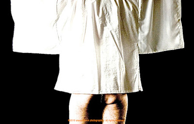
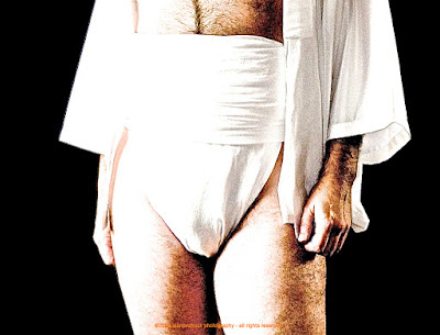
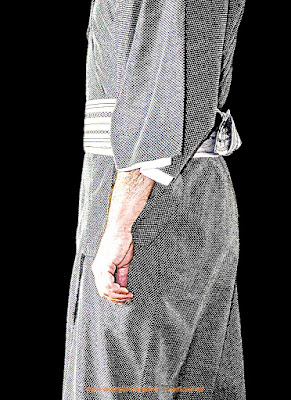
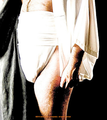
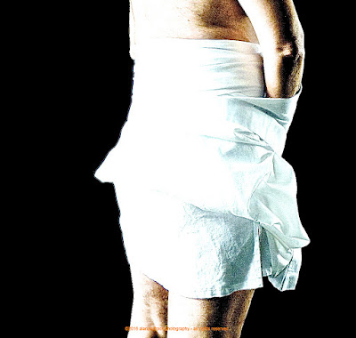
Fundoshi Rehash 33 - Black Voile

I know this seems a bit out of order, but I have been updating loosely based on the look of the rehash photos. The extras fundoshi pictures from this shoot only had enough for about 1.5 rehashes, so I just did one. Lazy me!!!!

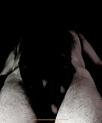
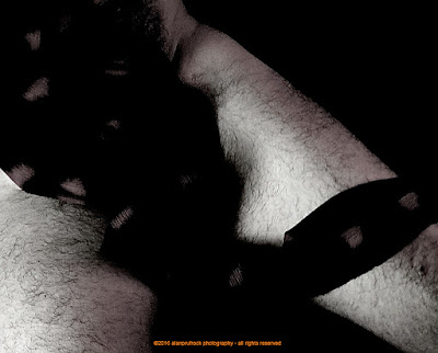
Once again, I found the originals a bit soft and wanted to change that up a bit. I also purposefully made the originals light and airy. For this rehash, I wanted if I could put a little more mood onto them. 

fundoshi rokushaku
fundoshi rokushaku


The first change came with just using a filter called Definition....and you can see above what it did. 

fundoshi rokushaku
fundoshi rokushaku 
Next up was using the Edge Sharpen filter and I also added a bit of a dark vignette around the edges of the photos. After that, I used a filter I haven't played with yet called Polarize and really liked what it did. For the final look below, I adjusted the contrast until I was pleased! 
fundoshi rokushaku
fundoshi rokushaku
fundoshi rokushaku
fundoshi rokushaku


...more...

Sunday, August 7, 2016

Fundoshi Rehash 35 - Deep Burgundy Gauze Part 2

Shots from the original shoot can be found here and here. For this set of fundoshi extra photos, I wanted an 'almost' black and white look. 
fundoshi rokushaku
fundoshi rokushaku 

Since the focus on these is soft, I sharpened them up a bit by increasing the exposure, contrast, black point and a few other filter tweaks. Of course, you can see I used the edge sharpen filter again, making the individual hairs stand out. 
fundoshi rokushaku
To achieve the final look above, I converted to black and white, then backed off of it by about 25%. This left a slight hint of color....and I was done! 
fundoshi rokushaku
fundoshi rokushaku
fundoshi rokushaku
fundoshi rokushaku

...more...

Sunday, July 31, 2016

Fundoshi Rehash 32 - Black and White Gauze Part 3

Originally seen herehere and here, this is the third set of fundoshi rehash photos from the surplus vault. For the first set, I did some subtle changes to make the photos pop out a bit more than the originals. The second rehash set took a more vibrant approach and I attempted to use the non-word neony to describe the look. Today, a bit of my favorite black and white take on the photos.

fundoshi rokushaku
fundoshi rokushaku


The first step was to play a bit with the exposure by increasing it. At the same time, I increased the black point because the I wanted a very stark black and white for the final result.
fundoshi rokushaku
fundoshi rokushaku


I then bumped up the contrast quite a bit and increased the saturation. For the black and white filter, I kept the reds at 100% and put the greens at 59% and the blues at 15%. This gave me the desired blow-out effect I wanted. The final step below was to use the edge sharpen filter since the original photos were inherently soft. 
fundoshi rokushaku
fundoshi rokushaku
fundoshi rokushaku
fundoshi rokushaku


...more...

Sunday, July 24, 2016

Fundoshi Rehash 40 - Purple Gauze Look 3, Part 2

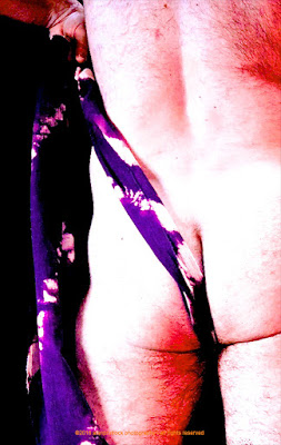
The original photos can be found herehere and here. In a previous rehash set, I removed some of the red and pink tones that were part of the lighting. For this set of surplus fundoshi photos, I decided to turn up the colors a bit and to blow out the skin tones.
fundoshi rokushaku
fundoshi rokushaku


First, a little change of the light, turning up the warm tones. 
fundoshi rokushaku
fundoshi rokushaku 


Next, the exposure was blown out a bit. I then played with the color saturation and vibrancy to ensure the shadows were showing reds instead of blacks. 

fundoshi rokushaku
fundoshi rokushaku
fundoshi rokushaku

...more...

Sunday, July 17, 2016

Fundoshi Rehash 25 - Sarashi Fundoshi - Part 3

The original photo shoots can be seen herehere and here. You can also see it in this kimono photo set. All these were using a fundoshi make of traditional sarashi fabric from Japan. In previous rehashes of the surplus pictures, I went with a black and white, then with a softening of the mood. Today, I take a little more harsh approach. 
fundoshi rokushaku
fundoshi rokushaku 

I started by increasing the exposure quite a bit. You can see how some of the white fabric is a bit blown out by this. 
fundoshi rokushaku
fundoshi rokushaku 

Then, the contrast was upped a bit, making the blow-out even more pronounced. I then tweaked the blacks a bit and increased the definition. To get to the final look below, I used one of my favorite tools - the edge sharpen filter. Now, it is how I wanted - a bit harsh with a graphic feel.
fundoshi rokushaku
fundoshi rokushaku
fundoshi rokushaku
fundoshi rokushaku
fundoshi rokushaku
fundoshi rokushaku
fundoshi rokushaku
fundoshi rokushaku
fundoshi rokushaku
fundoshi rokushaku
fundoshi rokushaku
fundoshi rokushaku
fundoshi rokushaku
fundoshi rokushaku
fundoshi rokushaku
fundoshi rokushaku
fundoshi rokushaku
fundoshi rokushaku
fundoshi rokushaku
fundoshi rokushaku
fundoshi rokushaku
fundoshi rokushaku
fundoshi rokushaku
fundoshi rokushaku
fundoshi rokushaku
fundoshi rokushaku