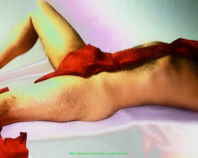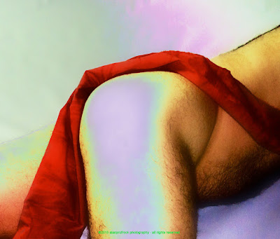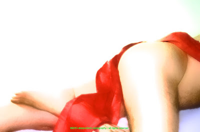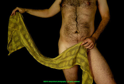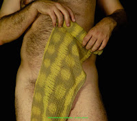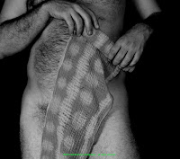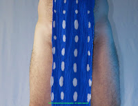
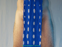
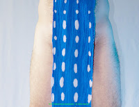
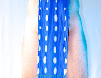
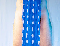
Above are the transitions the photos went through. Some are a bit more subtle than others. I started by changing the light to be a bit cooler. I then increased the exposure a bit and made the blacks a little blacker. I played a little with the contrast and adjusted the mid-tone levels as well. I then played a bit with the light blue colors, making them have a slightly green tone. And for the finishing touch, I smoothed out the background a bit. I've always liked the combination of blue and green together, so was pleased with these results.
A blog by Alan Prufrock highlighting ʻpersonalʻ photography and fundoshi designs.
Sunday, August 30, 2015
Sunday, August 23, 2015
Fundoshi Rehash 12 - Red Batiste Part 2
Still going with the extra red batiste fundoshi photos oringially found here. I wanted to see if I could use the look from last week as the starting point. I didn't really have a goal, so just started playing a bit and came up with the following.
Here is the look from last week.
I started by decreasing most of the 'skin smoothing' filter I had applied. I also removed the blurring I did around the hard edges.
I then added a new 'intensify contrast' filter to pump up the color fields. This left some hair artifacts in some of the colored areas that I didn't quite like.
To finish everything, I added some blur to the detailed areas I wasn't happy with. This was mostly in the highlighted portion of my skin that the intensify contrast filter had turned lavender.
...more...
Sunday, August 16, 2015
Fundoshi Rehash 12 - Red Batiste Part 1
For this rehashed photo shoot, I revisited the extra photos that were part originally posted here. This is the red batiste fundoshi that was quite difficult to discharge and some of the effects were very different than what I was intending.
Here is the original.
I wanted to see how far I could soften the images, so I started by simply increasing the exposure to lighten up the mood. I also played a bit by increasing the mid-tone contrast.
Next, I generously applied a 'skin smoothing' filter to tone down the fine details. This left a hard edge.
To complete the look, I used a blur tool to soften that hard edge.
This left me with the softness I was looking for, kind of like looking at the images through glass - some details remain, but much is obscured.
...more...
Sunday, August 9, 2015
Fundoshi Rehash 11 - Khaki Cheesecloth Part Three
Once last time into the fray known as the khaki cheesecloth fundoshi extra photos and their subsequent manipulations. The origins of these extra photos can be found here and here. You can also find this same fundoshi in this stripping shoot.
Last time, I desaturated a bunch of the color and vibrancy. This time, I will turn it all up a notch!
original |
exposure and black point enhanced |
contrast and vibrancy increased |
And finally, a little tweaking of the color levels and I achieve what I was hoping for - good definition and bright oversaturated color.
...more...
Sunday, August 2, 2015
Fundoshi Rehash 11 - Khaki Cheesecloth Part Two
Once again with the comfortable khaki cheesecloth fundoshi. For reference (if you havenʻt been faithfully following), you can find the original shoot photos here and here. You can also find this same fundoshi in this stripping shoot.
original |
increased contrast and saturation |
black and white filter |
vignette filter |
a slight fade applied |
edge blur |
And for the final look, I increased the boost. I actually donʻt know what was being boosted, but I liked the results!
...more...
Subscribe to:
Posts (Atom)