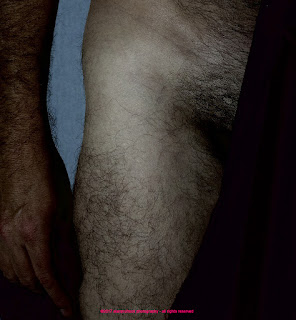
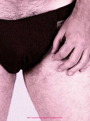
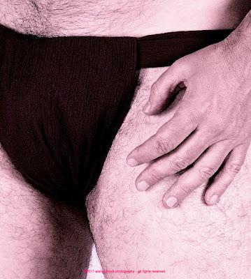
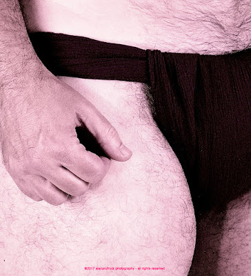
For these extra photos from the burgundy gauze fundoshi up-close session (originally seen here), I took a round-about path to a desired result. I'm sure there was a simpler way to accomplish the same thing, but here goes....
From the starting point above, I went to a deep black and white and sharpened the image quite a bit. I also upped the contrast, though it is hard to tell at this point.
I then took out about 65% of the black and white filter. Part of the reason for the filter was to get a certain tonal quality before my intended 'final product'.
And here it is below. Using the base color of the fundoshi, I applied a monochrome filter and kept it at about 50%, giving a deep pink tone to the photo.
...more...
...next up on fundoshi fabric and photos - grey voile fundoshi rehash #3....











No comments:
Post a Comment