For the last take on this white voile fundoshi in the shower (thus, the ʻwetʻ designation), I upped the drama a bit by darkening the photo. I also played up some of the cooler tones in the tile background.


For the last take on this white voile fundoshi in the shower (thus, the ʻwetʻ designation), I upped the drama a bit by darkening the photo. I also played up some of the cooler tones in the tile background.
This one was easy - I just used a pre-canned filter in my editing software that put a glimmer of light on the photos...almost like a prism was hanging in the window, but with way more light pollution!


For this post-production set of the grey voile fundoshi photos, I went for a late 60s, early 70s polaroid look where the cameraʻs flash was just a little bright for the room. That was what I was going for, anyway. Here they are!


And for this set, a traditional black and white treatment of the stripping shoot in a blue gauze fundoshi. I sharpened up the blacks and details a bit to add some drama.


The new photo editing software I use includes a bunch of filters and effects that with the touch of a button, can be applied to photos and viola - instant success. This is one of those filters that introduces some light noise to the photo from the white voile fundoshi ʻwetʻ shoot. I did lighten the base photo up a bit from an exposure perspective prior to applying the filter. I think it works well with the colors of the fundoshi.


For this take on the photos of the red batiste fundoshi, I went a little ʻgauzyʻ with my filters, trying to get a soft, dream quality. At the same time, I kept the saturation on the red channel to highlight the fundoshi.


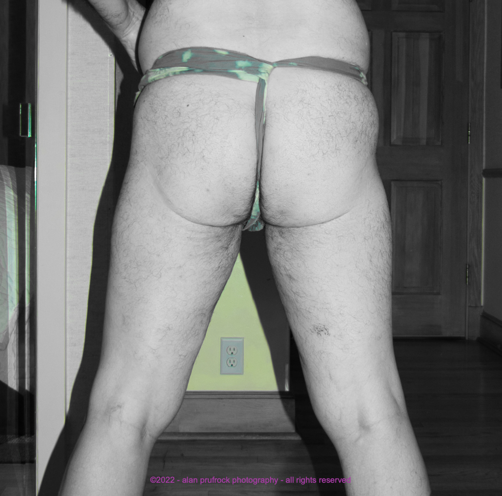
Once again, I took the easy way out to achieve the effect I wanted. The idea was to only show the color of the design. As you will note, some background color got in the way! I also took a little softer approach to the black and white, which I usually get pretty heavy-handed with.