And for this set, a traditional black and white treatment of the stripping shoot in a blue gauze fundoshi. I sharpened up the blacks and details a bit to add some drama.


...more...
And for this set, a traditional black and white treatment of the stripping shoot in a blue gauze fundoshi. I sharpened up the blacks and details a bit to add some drama.
The new photo editing software I use includes a bunch of filters and effects that with the touch of a button, can be applied to photos and viola - instant success. This is one of those filters that introduces some light noise to the photo from the white voile fundoshi ʻwetʻ shoot. I did lighten the base photo up a bit from an exposure perspective prior to applying the filter. I think it works well with the colors of the fundoshi.


For this take on the photos of the red batiste fundoshi, I went a little ʻgauzyʻ with my filters, trying to get a soft, dream quality. At the same time, I kept the saturation on the red channel to highlight the fundoshi.


Once again, I took the easy way out to achieve the effect I wanted. The idea was to only show the color of the design. As you will note, some background color got in the way! I also took a little softer approach to the black and white, which I usually get pretty heavy-handed with.


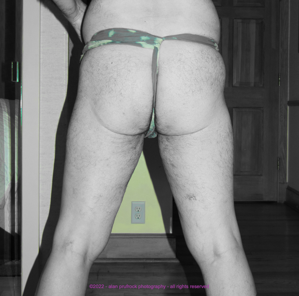
For todayʻs take on the blue gauze fundoshi, I did a spot color on the fundoshi. Basically, I turned all the colors off in my editing software, except for the cyan channel. This did leave some color left over in some of the photos, but it was much easier than hand painting the color in each picture!


I found a tool in my editing program I havenʻt used before. It allows for an elliptical shape to be masked in the photo, allowing different affects to splash across the picture. I used it for some of the shower shots in a white fundoshi in order to show the subtle colors of the fabric design. To get the affect, I first increased some of the saturation levels, converted to black and white, then applied the tool to remove the black and white application. I think some of these turned out better than others. I may have to spend more time to find a bit more finesse in using the tool.


For this post-production mayhem, my goal was to make the fundoshi photos look like they were part of a cheap newsprint publication that may have been found in someoneʻs attic.


