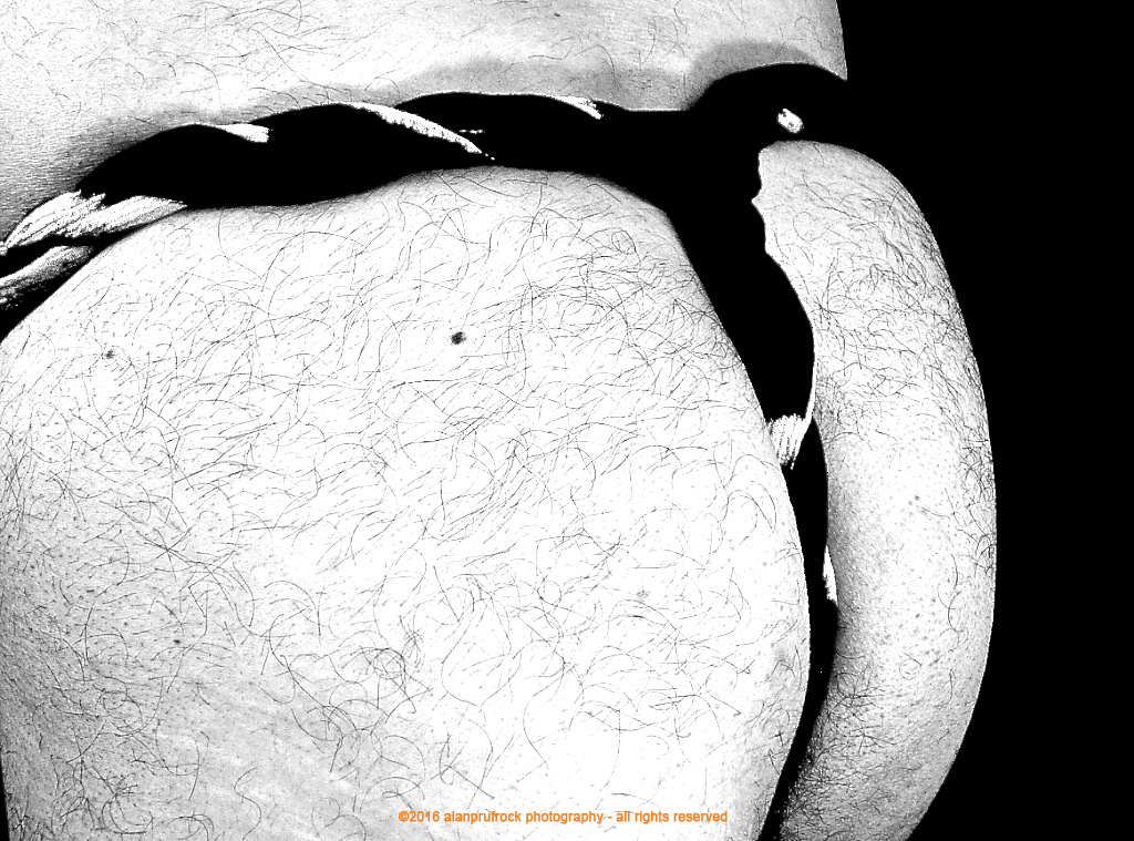
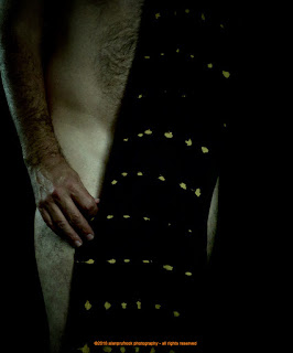
Sunday, July 31, 2016

Fundoshi Rehash 32 - Black and White Gauze Part 3

Originally seen herehere and here, this is the third set of fundoshi rehash photos from the surplus vault. For the first set, I did some subtle changes to make the photos pop out a bit more than the originals. The second rehash set took a more vibrant approach and I attempted to use the non-word neony to describe the look. Today, a bit of my favorite black and white take on the photos.

fundoshi rokushaku
fundoshi rokushaku


The first step was to play a bit with the exposure by increasing it. At the same time, I increased the black point because the I wanted a very stark black and white for the final result.
fundoshi rokushaku
fundoshi rokushaku


I then bumped up the contrast quite a bit and increased the saturation. For the black and white filter, I kept the reds at 100% and put the greens at 59% and the blues at 15%. This gave me the desired blow-out effect I wanted. The final step below was to use the edge sharpen filter since the original photos were inherently soft. 
fundoshi rokushaku
fundoshi rokushaku
fundoshi rokushaku
fundoshi rokushaku


...more...

Sunday, July 24, 2016

Fundoshi Rehash 40 - Purple Gauze Look 3, Part 2

The original photos can be found herehere and here. In a previous rehash set, I removed some of the red and pink tones that were part of the lighting. For this set of surplus fundoshi photos, I decided to turn up the colors a bit and to blow out the skin tones.
fundoshi rokushaku
fundoshi rokushaku


First, a little change of the light, turning up the warm tones. 
fundoshi rokushaku
fundoshi rokushaku 


Next, the exposure was blown out a bit. I then played with the color saturation and vibrancy to ensure the shadows were showing reds instead of blacks. 

fundoshi rokushaku
fundoshi rokushaku
fundoshi rokushaku

...more...

Sunday, July 17, 2016

Fundoshi Rehash 25 - Sarashi Fundoshi - Part 3

The original photo shoots can be seen herehere and here. You can also see it in this kimono photo set. All these were using a fundoshi make of traditional sarashi fabric from Japan. In previous rehashes of the surplus pictures, I went with a black and white, then with a softening of the mood. Today, I take a little more harsh approach. 
fundoshi rokushaku
fundoshi rokushaku 

I started by increasing the exposure quite a bit. You can see how some of the white fabric is a bit blown out by this. 
fundoshi rokushaku
fundoshi rokushaku 

Then, the contrast was upped a bit, making the blow-out even more pronounced. I then tweaked the blacks a bit and increased the definition. To get to the final look below, I used one of my favorite tools - the edge sharpen filter. Now, it is how I wanted - a bit harsh with a graphic feel.
fundoshi rokushaku
fundoshi rokushaku
fundoshi rokushaku
fundoshi rokushaku
fundoshi rokushaku
fundoshi rokushaku
fundoshi rokushaku
fundoshi rokushaku
fundoshi rokushaku
fundoshi rokushaku
fundoshi rokushaku
fundoshi rokushaku
fundoshi rokushaku
fundoshi rokushaku
fundoshi rokushaku
fundoshi rokushaku
fundoshi rokushaku
fundoshi rokushaku
fundoshi rokushaku
fundoshi rokushaku
fundoshi rokushaku
fundoshi rokushaku
fundoshi rokushaku
fundoshi rokushaku
fundoshi rokushaku
fundoshi rokushaku

Sunday, July 10, 2016

Fundoshi Rehash 34 - Brown Voile

This particular brown voile fundoshi design was originally seen in the ʻConnect the Dotsʻ photos here and here

In dealing with the extra photos from the shoot, I wanted to see if I could get a different tonal quality out of the pictures. 
fundoshi rokushaku
fundoshi rokushaku 

The original has a nice, even tone and the dark brown fabric lent itself to keeping the pictures in a tan/beige look. To start with, I added a vignette to darken the edges.
fundoshi rokushaku
fundoshi rokushaku 

I then played a bit with the contrast of the mid tones. I then made some adjustments to the exposure, saturation and vibrancy which resulted in the yellow tones.
fundoshi rokushaku
Finally, I adjusted the white balance to give them a cooler look. As you will see through the shoot, this resulted in some photos having more blue tones than others. I think this was due to how close I was to the camera, which would have a bearing on how much information was captured. 

fundoshi rokushaku

fundoshi rokushaku

fundoshi rokushaku

...more...